Rearchitecting a Large Scale Intranet for an Online University
Client:
Athabasca University is an accredited online university based out of Athabasca, Alberta, Canada. They offer flexible distance learning with world-class courses, undergraduate, graduate programs, and professional development. Founded in 1970, it is one of four comprehensive academic research universities in Alberta, and was the first university in Canada to specialize in distance education.
Role:
As Manager, Digital User Experience, I lead the UX team through the initial review of the University Intranet user experience and prepared the architectural documentation to develop a new and improved information architecture experience for the employees of the University.
Problem:
Athabasca had an Intranet that had been pieced together by IT and other departments in an ad-hoc manner for over 20 years. The Intranet had grown to include over 900 pages of content, 400 mailing lists, 175 PDF documents, and 90 forms. The existing Intranet was difficult to navigate, had no search functionality, lacked a cohesive design, and was not being updated or ever-greened over time. Each department within the organization independently developed their own content with limited collective management of the space. The department based structure made finding information difficult for employees. While there were plenty of technical solutions available in the marketplace to replace the existing Intranet, there was a need to complete the often overlooked work of re-designing the information architecture to structure the content of the intranet to be more logically organized and user friendly.
Solution:
The content of the existing Intranet needed to be audited and reorganized. A new technical solution needed to be implemented that had a unified design style, search, a centralized location, and had content authoring workflow capability. The existing information architecture needed to change from a department-based structure to task-based structure to ease the cognitive load and decrease the time needed to locating information. To accomplish these goals, I led the UX Team through a four step process to Discover, Define, Develop, and Deliver a new and improved information architecture.
Process:
Step 1: Discovery
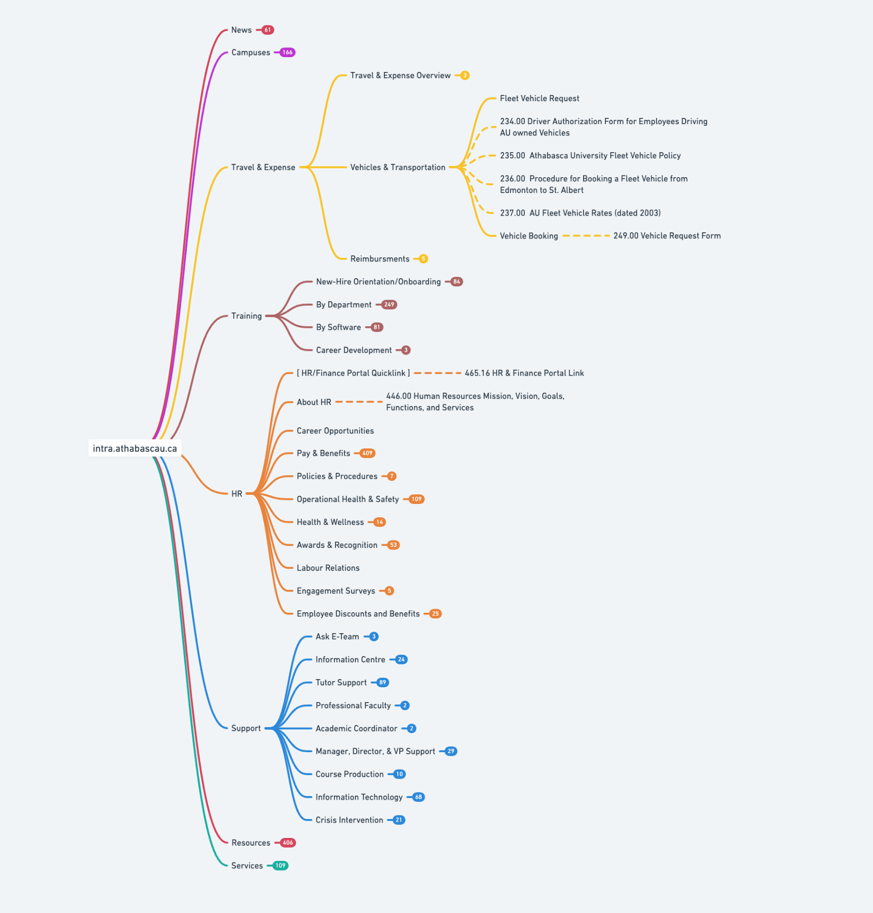
The first step was generating a sitemap of all available pages within the pre-existing Intranet. With a sitemap that outlined the full scope of the Intranet itself, the UX team could begin to understand the individual blocks of content on each page and what function they served the University. The UX team also conducted in-person and online interviews with numerous employees to discover the challenges and pitfalls the current structure was facing.
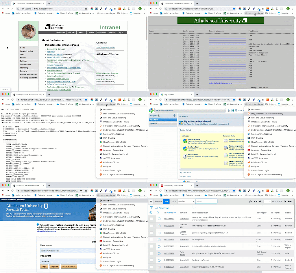
During the discovery phase, it became clear that the Intranet had become a disparate patchwork of non-cohesive indexes and system connections. Users were leaning on web bookmarks to find information relevant to their role. Content was becoming increasingly outdated, and some links were no longer functional. Because of the reliance on bookmarking, new employees were leaning heavily on more seasoned employees to find specific information within the system.
Step 2: Define
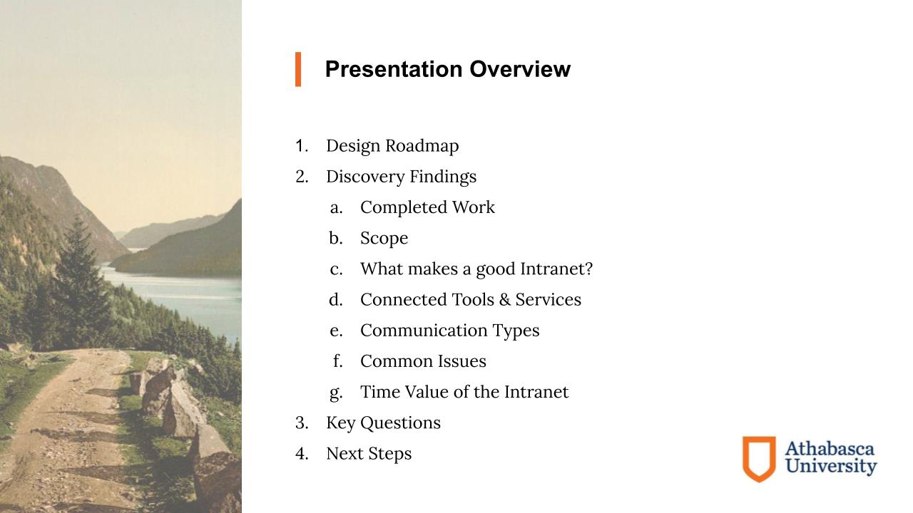
After the team completed the initial audit, I assembled and presented the findings to leadership in IT, University Relations, HR, and the Executive Assistant group. Our findings revealed the scope of the challenge Athabasca faced, but also provided a path forward for how we could work together to create solutions for an Intranet that had become a "Frankenstein" of a user experience.
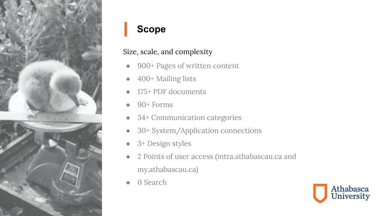
In scoping out the size of the pre-existing Intranet, the team discovered 900+ pages of written content, 400+ mailing list groups, 175+ PDF documents, 90+ forms, 30+ application connectors, multiple design styles, and 2 domains that were both utilized to access the space.
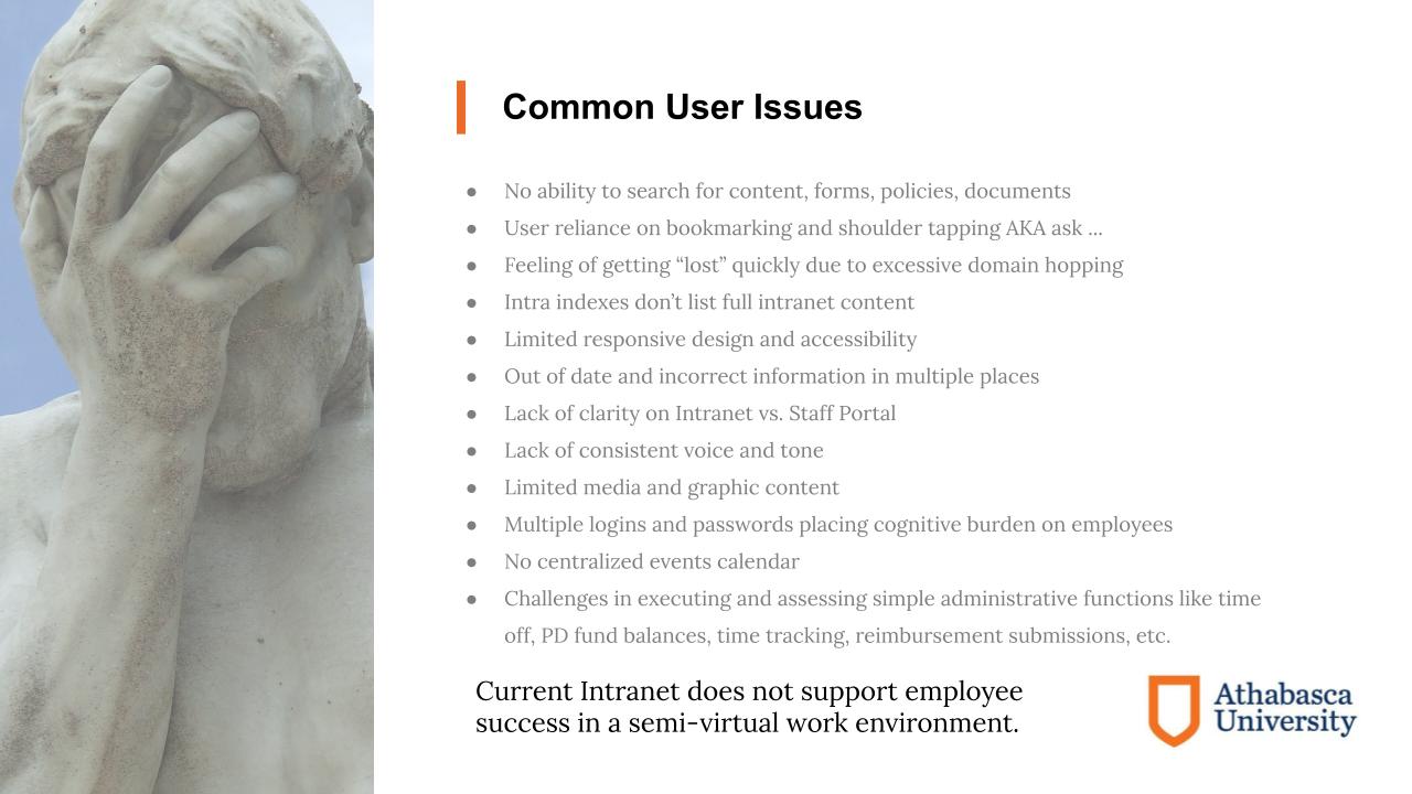
The team also made notes about common issues users were encountering with the Intranet. Issues which took the most prominence were ranked higher than less prominent items. No search function was one of the most highly cited issues by employees, which naturally led to a reliance on bookmarking and asking employees where to locate information. Other issues included indexes which did not contain the full scope of available content, lack of responsive design, out of date information, lack of consistent voice, and multiple logins embedded within the system.
Step 3: Develop
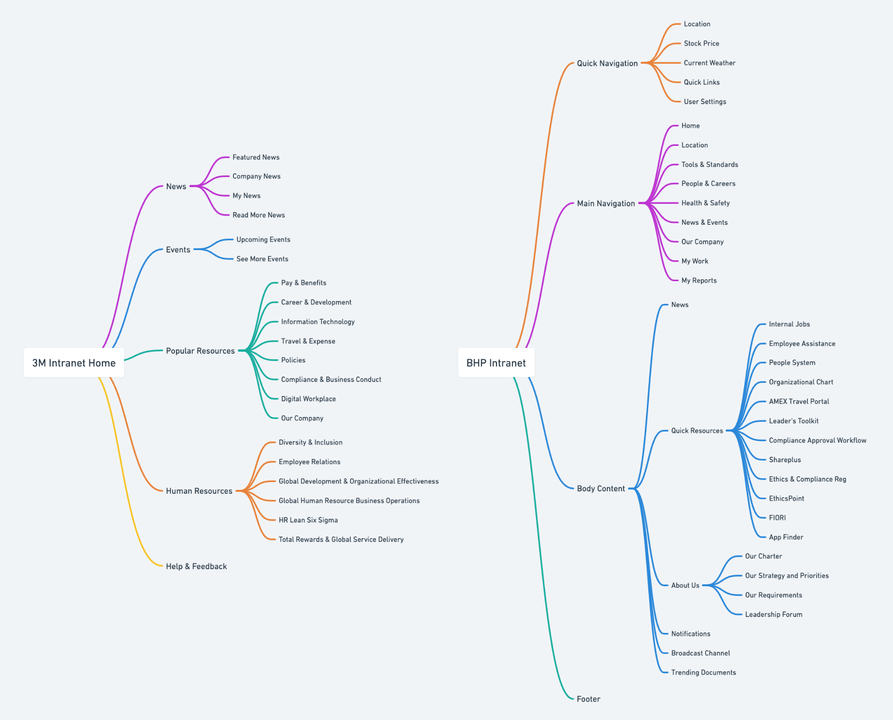
In order to develop a strong foundation for Athabasca's Intranet information architecture, the team spent some time studying other organizations who had large scale task-based Intranets to better understanding what common categories and structures were utilized to store information contained within.
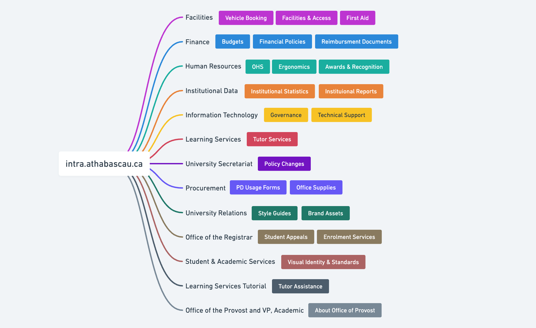
The team examined the pre-existing department based information architecture at Athabasca to compare and understand the difference between other organizations task-based structures.
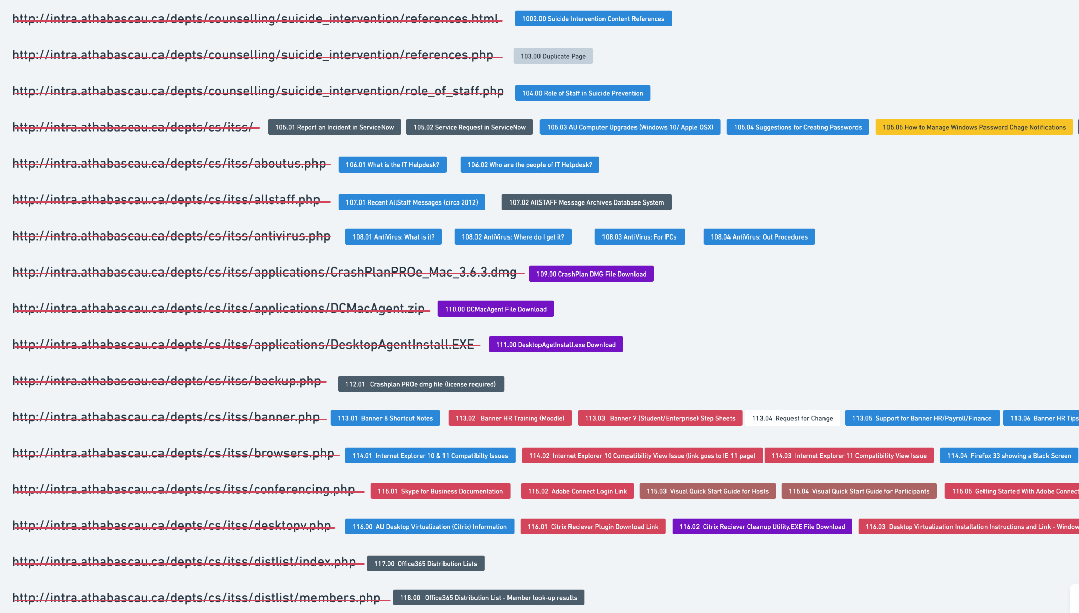
The team took each individual URL from the audited content index and identified the blocks of content that were contained within each URL page. These content blocks were each numbered and colour coded by content type. This allowed UX Designers the ability to quickly and easily group and resort the content blocks into more appropriate task based categories. This exercise generated over 1,400 individual pieces of content that were to be resorted into a new Intranet information architecture.
Utilizing a combination of structural research and the content specific to Athabasca University, the team began mapping out a structure for the content that would be no more than three layers deep. This ensured that all content within the Intranet would be accessible within three clicks of a mouse or less.

Step 4: Delivery
The final UX deliverable on this project was a complete task-based sitemap that had accounted for 1,400+ individual pieces of content across 900+ pages of existing Intranet. The structure was tree tested using Optimal Workshop to validate the categories the information and structure.
After successful testing, the team delivered both visual and excel versions of the information architecture for development in Microsoft Sharepoint. After 20 years of waiting, Athabasca employees received an Intranet that provided major boosts to organizational productivity, made it easy to find valuable content, and saved the organization time on a massive scale.
