Building an Accessible Design System from Scratch
Client:
Athabasca University is an accredited online university based out of Athabasca, Alberta, Canada. They offer flexible distance learning with world-class courses, undergraduate, graduate programs, and professional development. Founded in 1970, it is one of four comprehensive academic research universities in Alberta, and was the first university in Canada to specialize in distance education.
Role:
As Manager, Digital User Experience, I provided leadership and expertise in the creation of user experience interface design plans, processes, and standards across interfaces, websites, applications and self-serve systems. On this project, I lead the team through the design process of creating a highly accessible design system based on only four initial colours.
Problem:
Athabasca had been assembling websites, interfaces, applications, and self-serve systems in a siloed ad-hoc manner for over 20 years. This resulted in a large volume of website and system designs that were inconsistent and somewhat confusing for students and employees to navigate. The lack of cohesion across the university had an impact on the user experience for a new generation of students who were beginning to take note of the inconsistencies and communicate negative feedback about the organization through numerous online channels.
Solution:
Initially, the goal was to focus the team on developing a cohesive design system for the university. The reasoning for this was threefold. With a focused design system, all design decisions could be made derivatively from a single design document. Also, design teams could focus more on interaction, layout, and placement of elements without having to constantly re-invent the wheel of accessible visual design every time they approached a site, application, or interface. The design system also enabled siloed departments the opportunity to work collaboratively on visual design changes that could be iterated over time and successfully pushed out across the university stylesheets in a coordinated manner.
Process:
Step 1: Common Screen Sizes
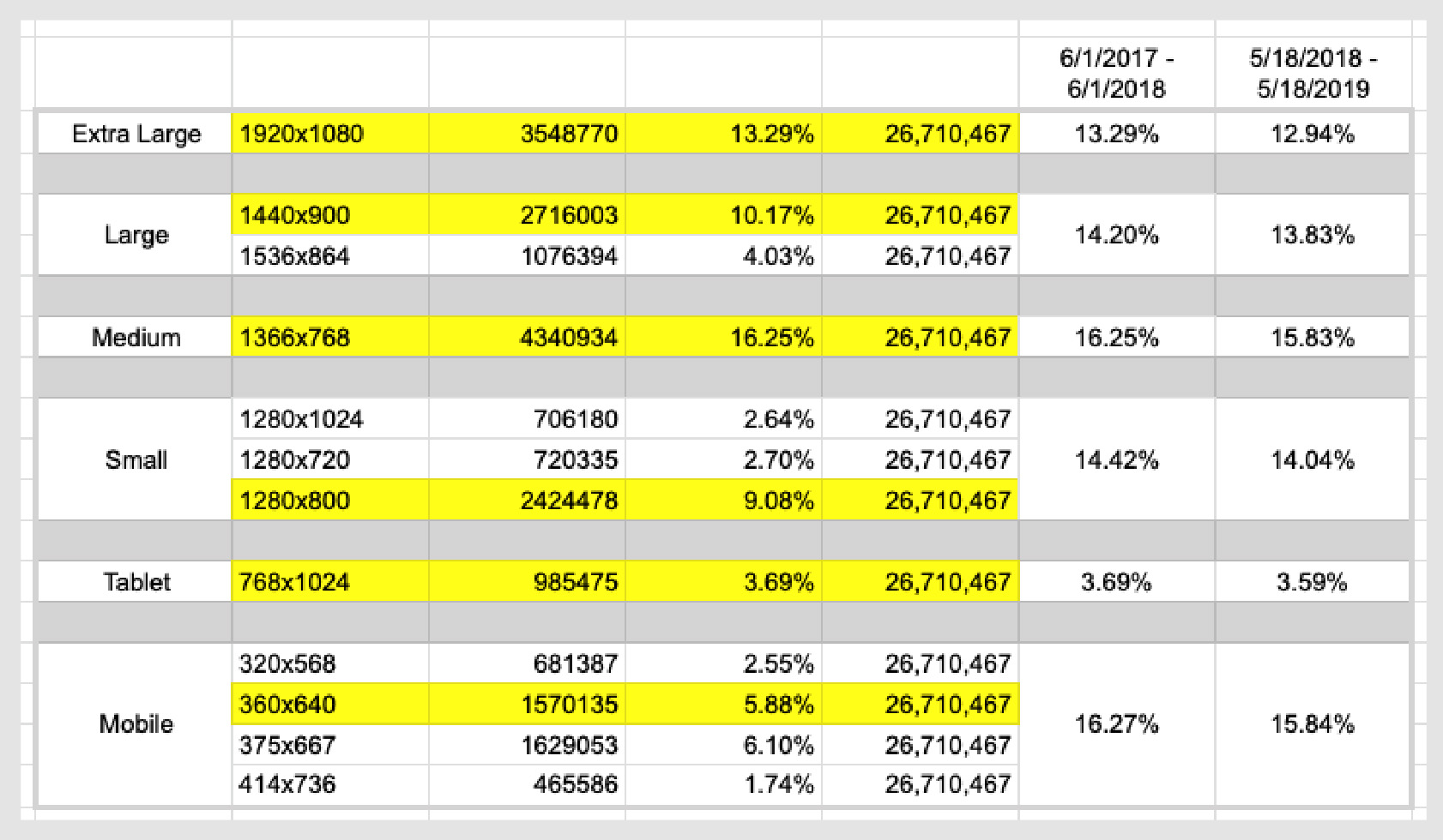
Before endeavouring to build out the design system. The team referenced data in Google Analytics to research the common screen sizes that weekly active users were utilizing to access the university systems. This gave us a data driven place to start in choosing which screen sizes to base the initial templates off of. The teams research discovered 80% of users were utilizing 6 different screen sizes which then became the basis for the 6 screen size grid system.

Step 2: Colour Scheme Accessibility Audit
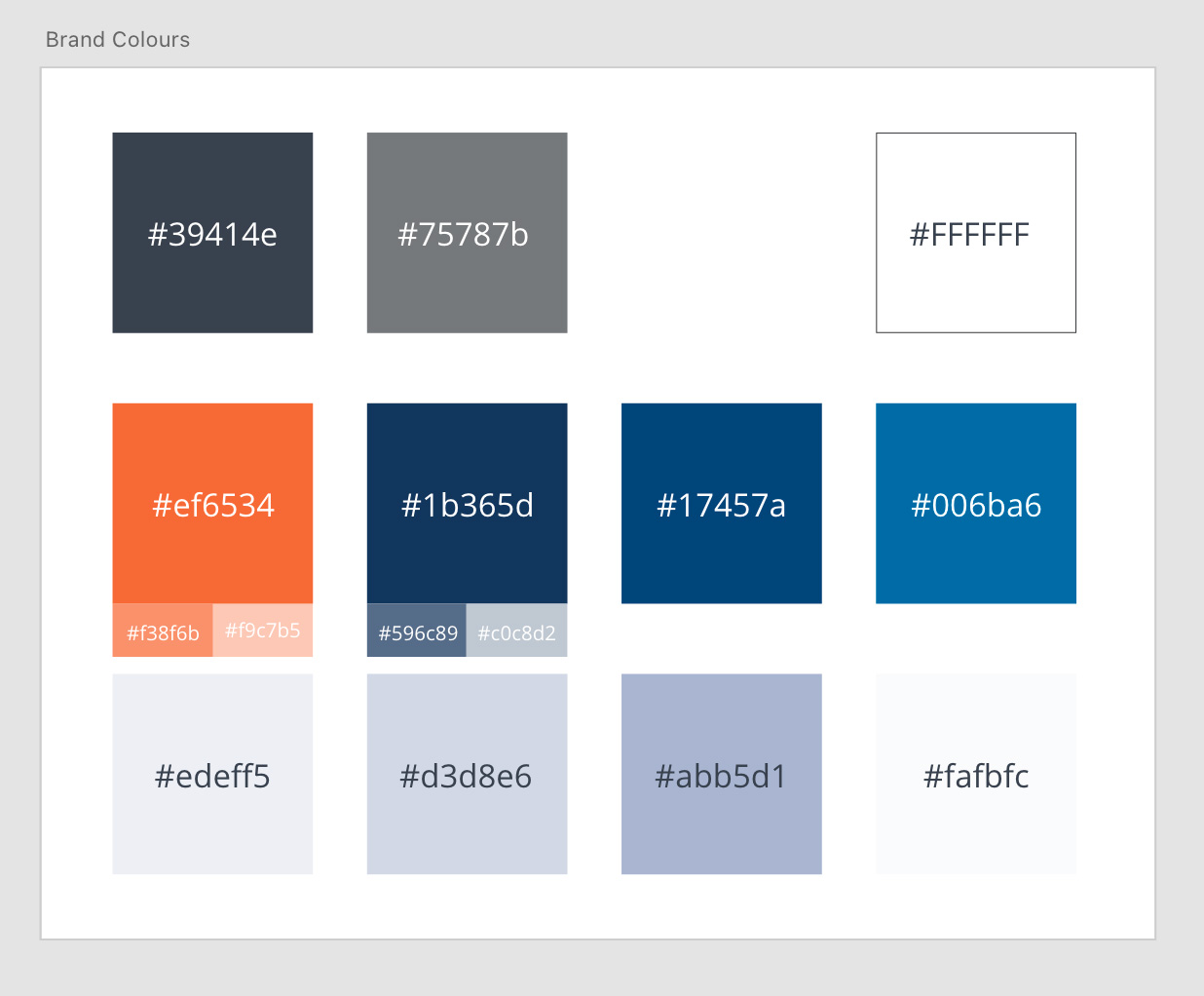
Athabasca University had only 4 official colours, with 7 official shades of those colours. The official colours were chosen primarily for usage with physical print materials despite the reality that the universities presence was largely online. The university wanted to reach the highest level of accessibility reasonably possible on the web and the pre-existing colour scheme was causing issues with contrast ratios that were preventing this level of accessibility from being reached.
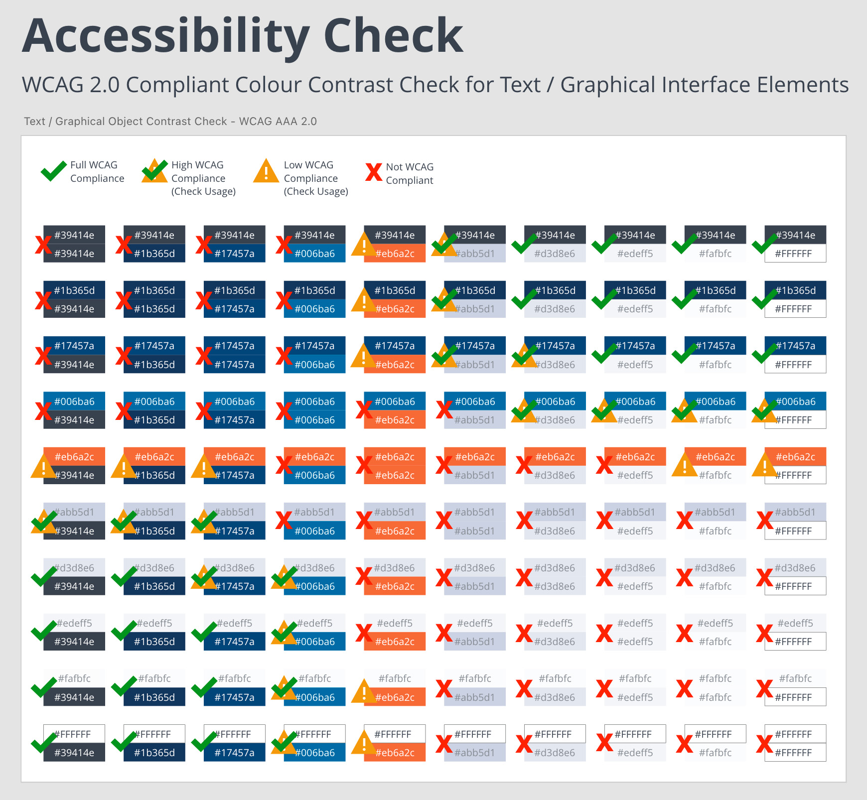
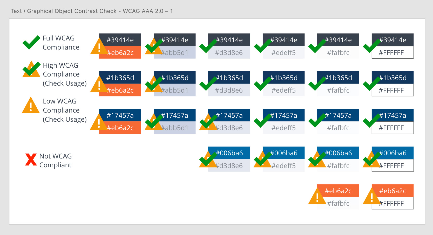
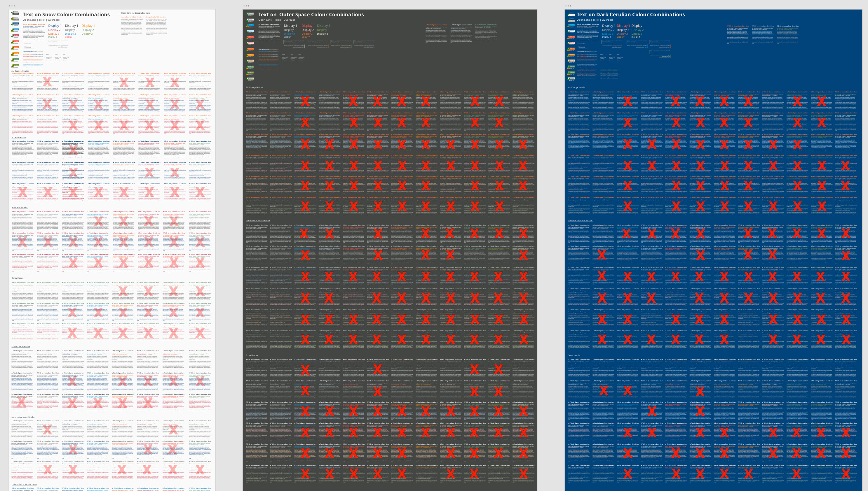
To better understand accessible combinations of these pre-existing colours, the team created an accessibility matrix to measure the colour contrast of all possible colour combinations. We did this to better understand which layout combinations would be considered WCAG Level AAA 2.0 accessible, and which combinations would violate or live at the fringe of the highest achievable level of visual accessibility.
Step 3: Expanding the Accessible Colour Palette
Because the University only had 4 official colours and some shades of these colours defined, there was an application development design need to expand the colour palette for various prompts and application state communications. We needed to create colour standards for alerts, successes, anchors, and warnings. Throughout the student experience employees had picked their own colour choices where no pre-existing standard had been defined, leading to a non-cohesive and sometimes confusing experience. The team worked to expand the web palette standards to provide more options for future web and application development.
We took the pre-existing colours and utilized a tetradic colour scheme of cross complimentary pairs to identify derivative accessible shades of reds, greens, yellows, and blues that could be adopted by the university for various visual communication states that would be needed in current and future development projects.
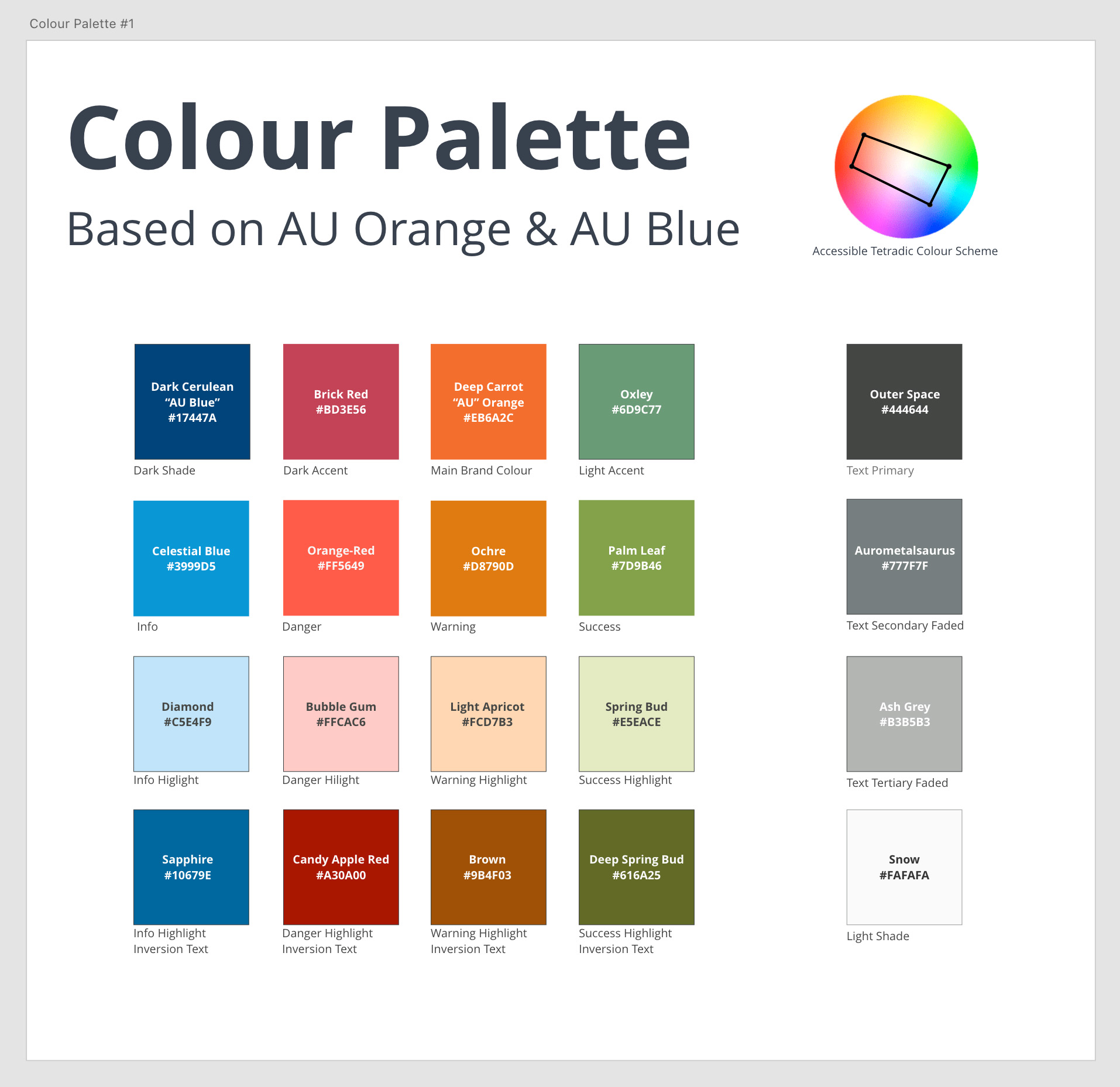
These expanded colour palette options were reviewed with the marketing department so they could help make decisions on which colours would be appropriate for the university to adopt within their sites, applications, and interfaces.
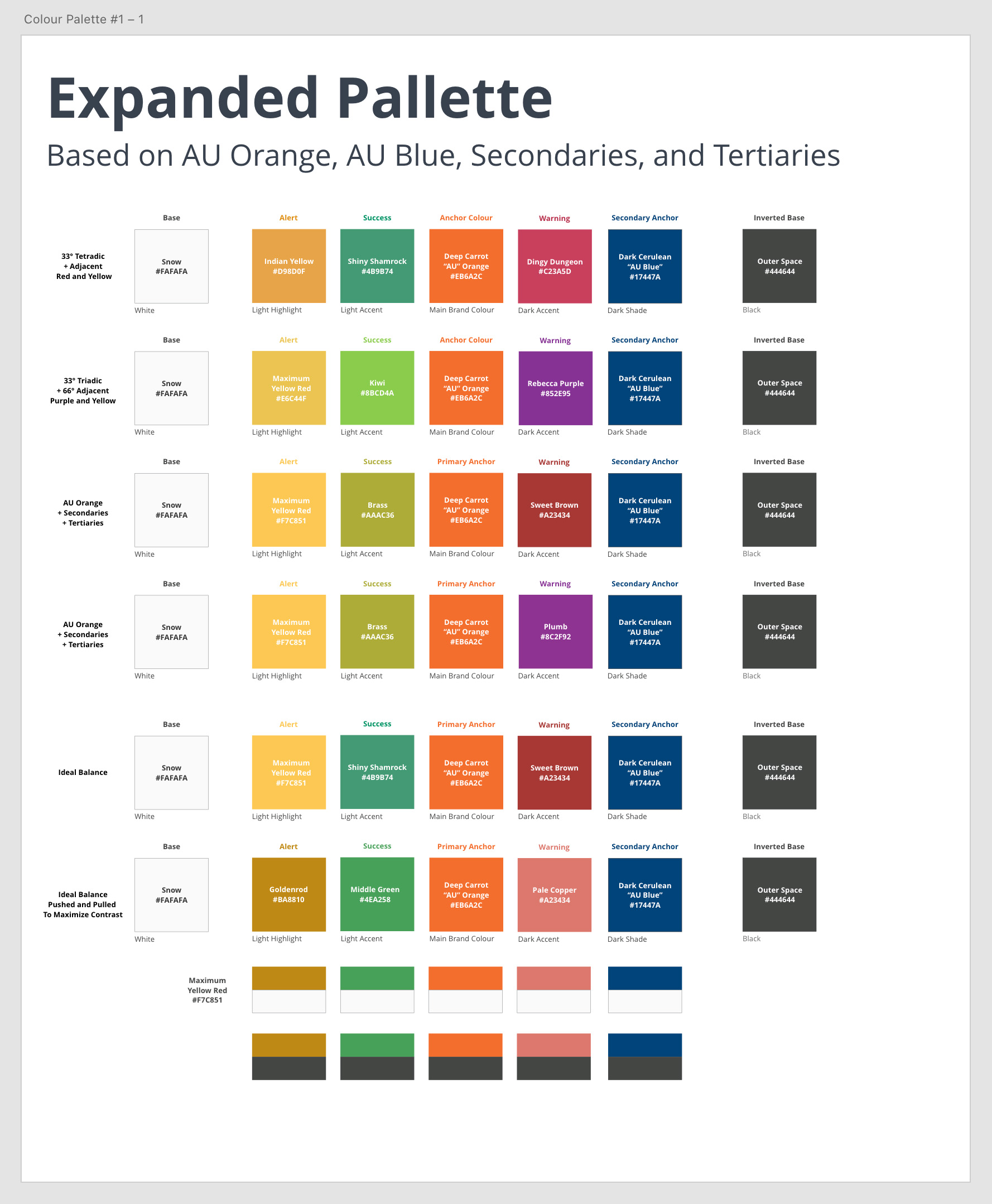
Once the expanded palette was developed, The team was able to then re-audit it to find several combinations of colours that could be used for more accessible web, application, and interface development.
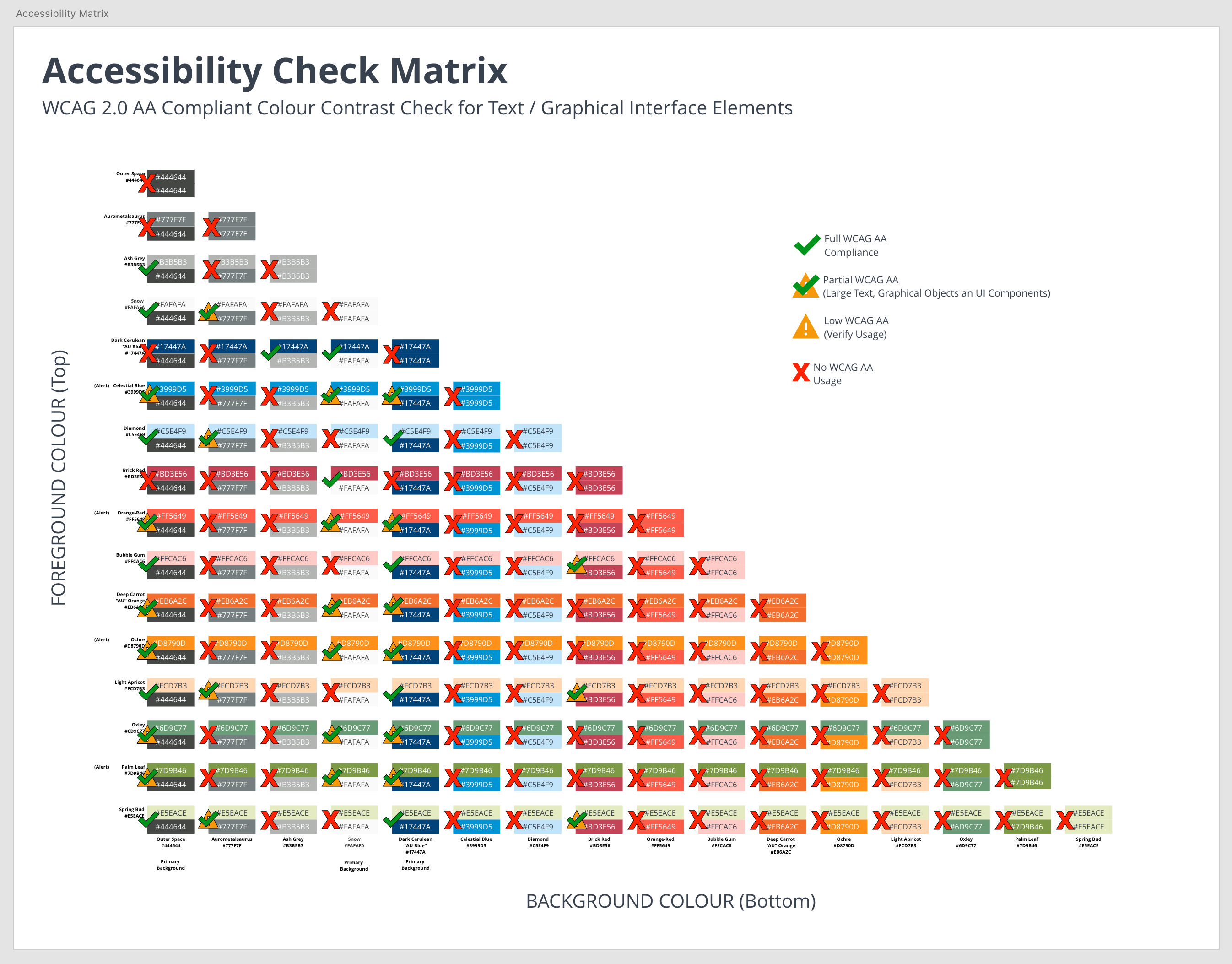
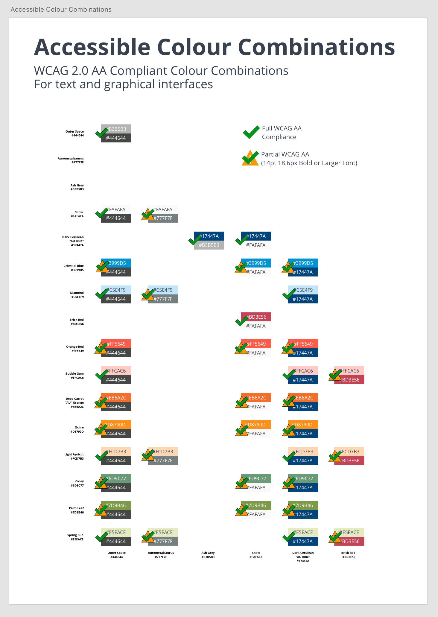
The audit resulted in creating a very specific list of possible colour combinations that could be used for web, application, and interface development.
Step 4: Developing Accessible Font Combinations
The next step involved taking the universities official fonts and utilizing golden ratios for H1, H2, and Paragraph element font sizes to identify font colour combinations that were easy to read, accessible, and user friendly.
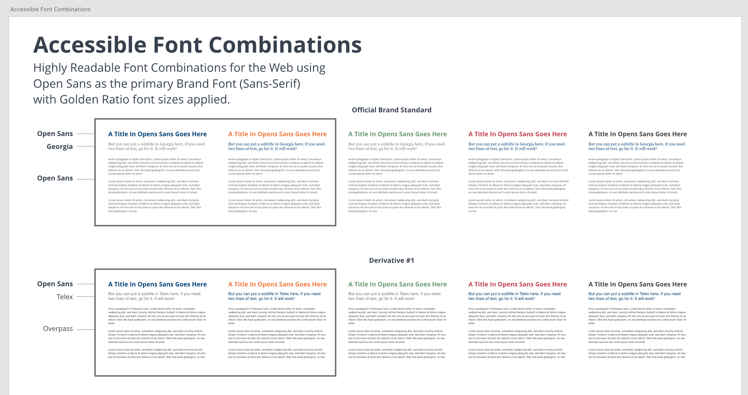
The team then identified accessible font combinations across the 3 pre-defined background colours that could be officially used for university websites, applications, and interfaces. This work provided a very clear list of possible background and text combinations while eliminating non-accessible options that may have been inadvertently be utilized by a well meaning, but ill informed designer, course developer, or application developer. By creating a very specific list of accessible font combinations, the team was able to remove design ambiguity up front and lessen the cognitive load on design teams as they approach new projects, sites, applications, and layouts.
Step 5: User Interface Elements and Details
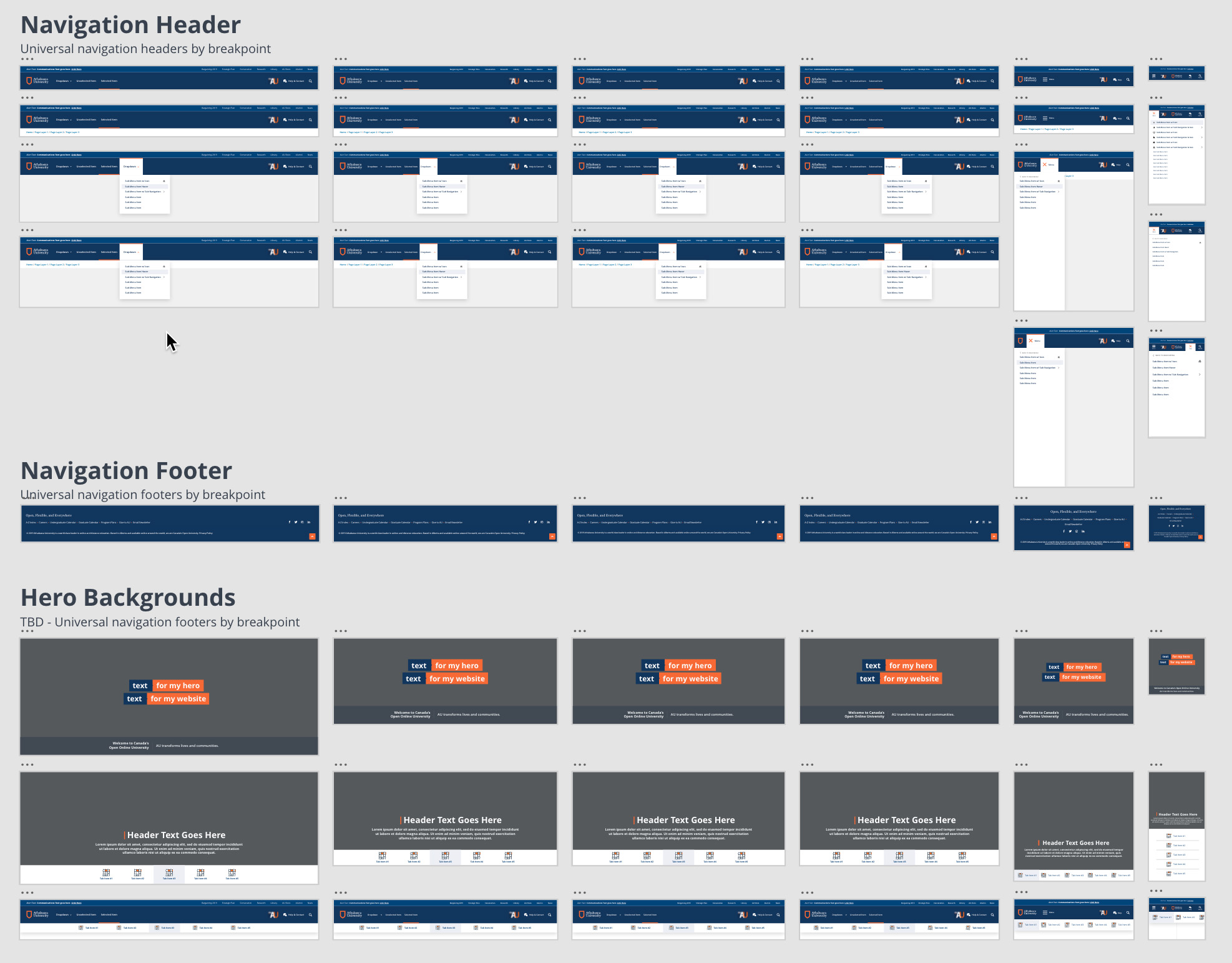
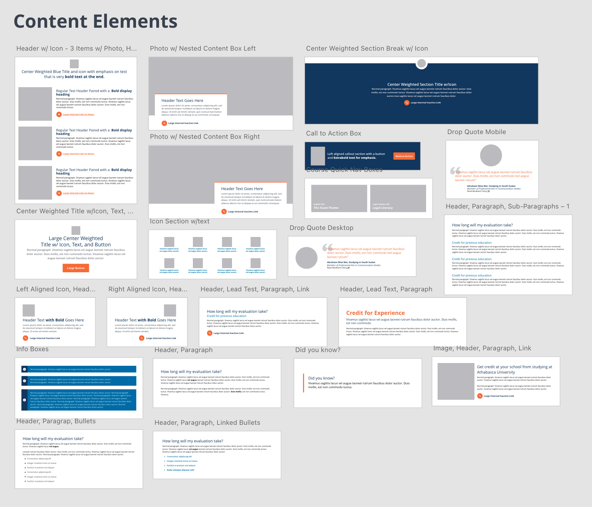
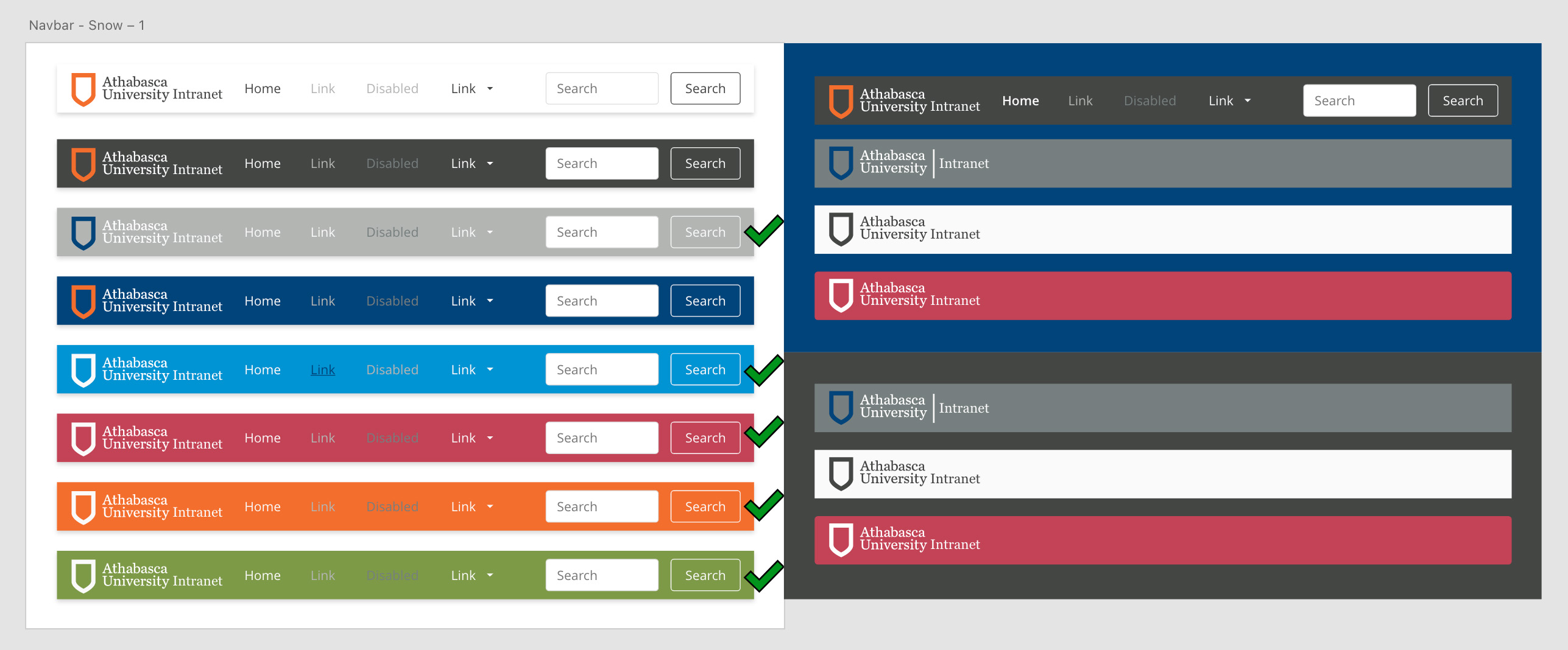
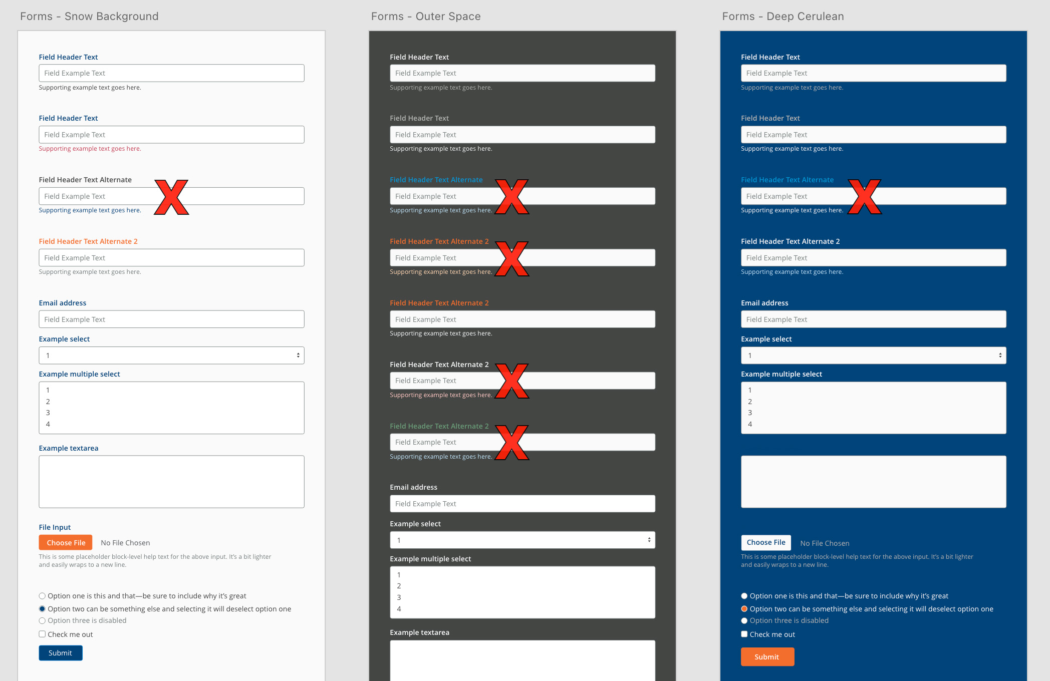
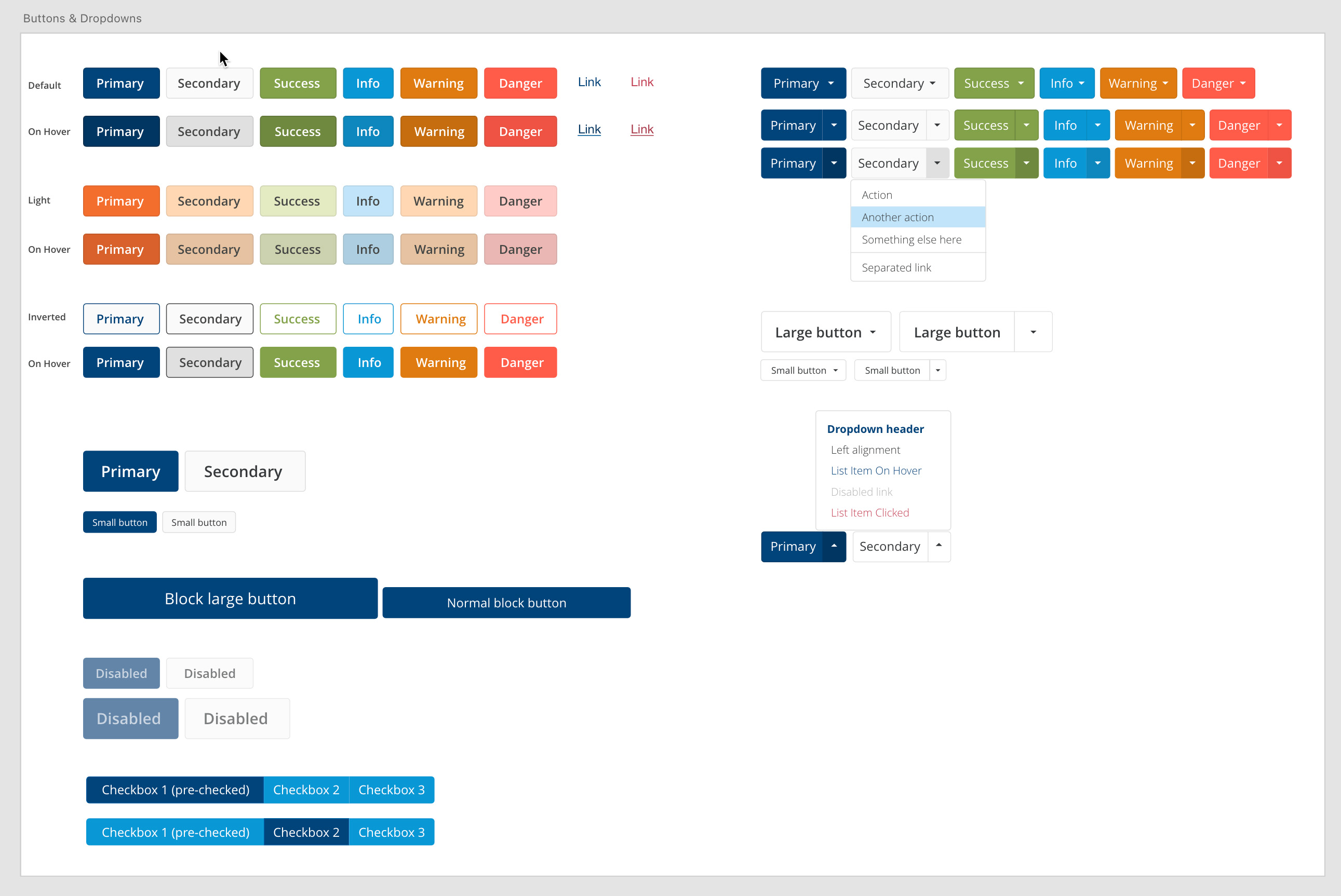
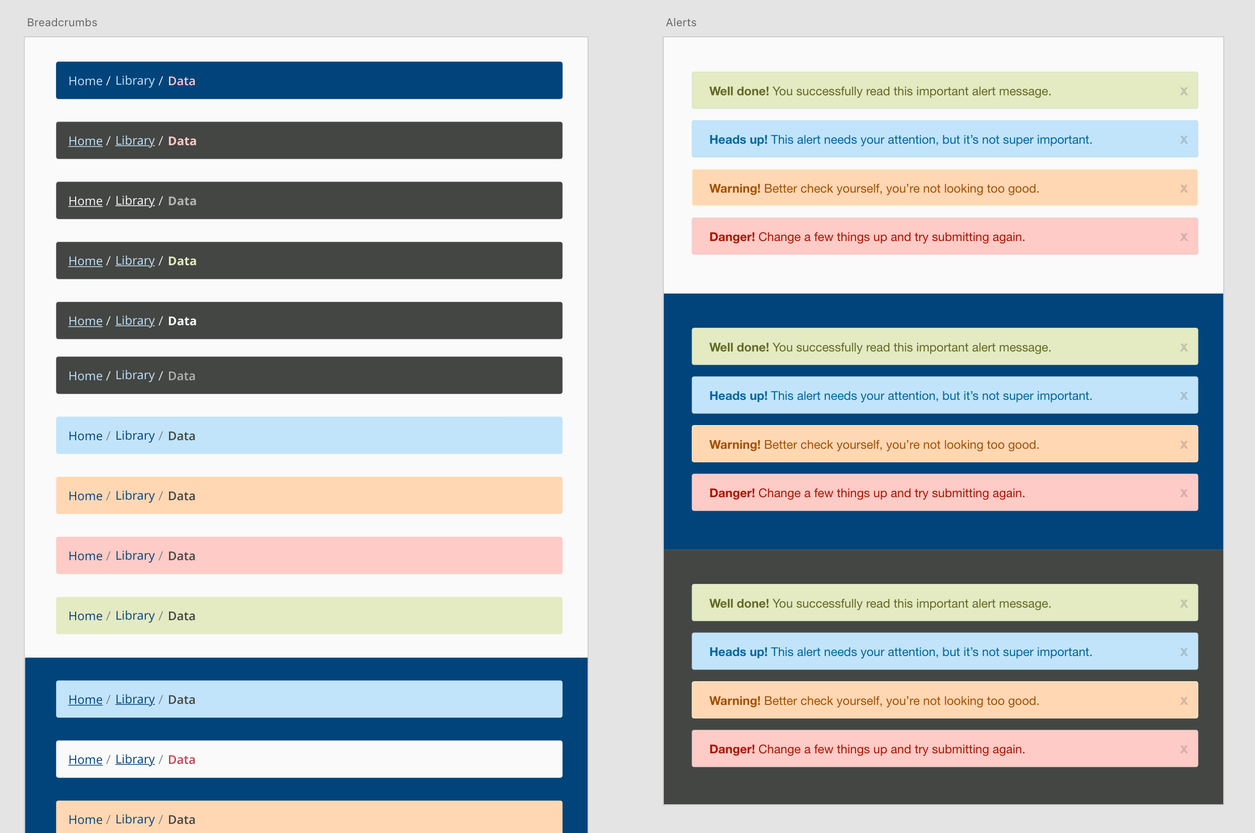
Once accessible colour schemes and font combinations were worked out, the team turned their attention to creating accessible UI elements based on the bootstrap framework. This included navigation bars, buttons, button states, forms, drop-downs, breadcrumbs, alerts, pagination, progress bars, and a whole host of more specific UI elements that can be continuously iterated over time based on a solid foundation of visual accessibility.
Step 6: Bringing it All Together
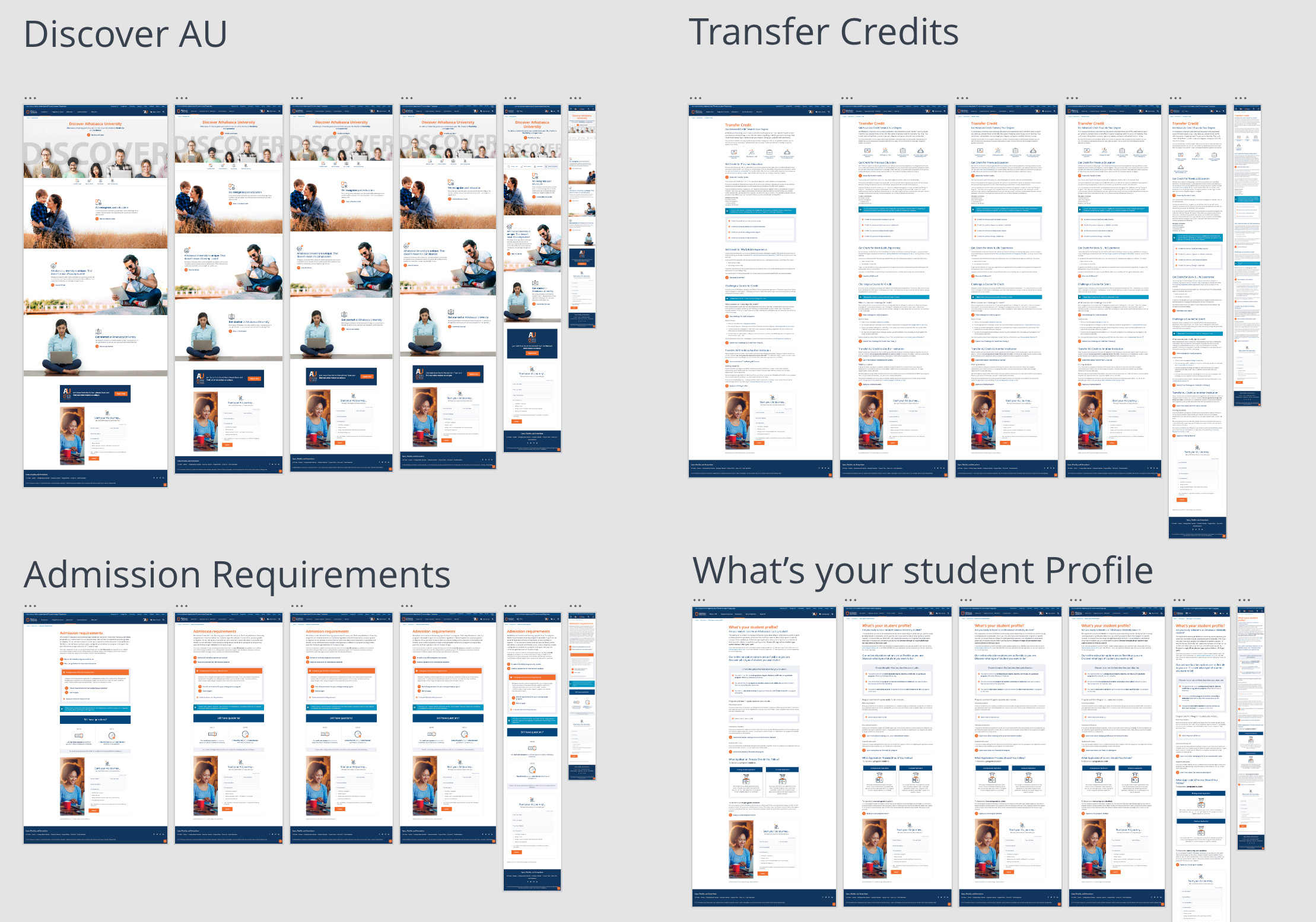
With a pre-defined set of highly accessible colour schemes, font layouts, and individual bootstrap elements, seasoned designers had access to a fully developed accessible design system to quickly and effectively mockup websites and applications across a variety of screen sizes for a multitude of projects. The existence of the design system helped facilitate better organizational collaboration, expedited the creation of designs, and created a central resource to iterate UX elements and micro-interactions over time. Accessibility need not be a burden to your organization, the possibilities for accessible design are limitless once you clearly define what can and can't be done within the box of a predefined accessibly goal.
